Question
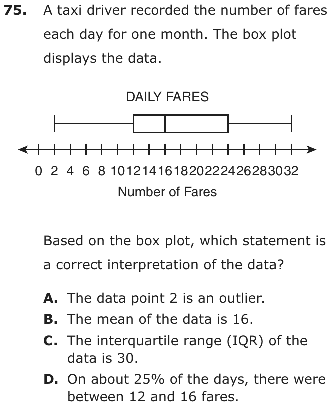
A taxi driver recorded the number of fares each day for one month. The box plot displays the data.
Based on the box plot, which statement is a correct interpretation of the data?
- AThe data point 2 is an outlier.
- BThe mean of the data is 16.
- CThe interquartile range (IQR) of the data is 30.
- DOn about 25% of the days, there were between 12 and 16 fares.
Show the answer
Correct answer: D
The amount of data in a box plot is broken into 4 parts, or quartiles, which each represent 25% of the data. So the amount of data represented between Quartile 1 (12) and the median (16) is about 25% of the data.
Question analysis
A statistics question on a box plot of the number of fares a taxi driver recorded each day for one month. Students decide which of four statements is a correct interpretation of the data, using what a box plot does and does not show. The statements draw on several different box plot ideas, so each one must be checked.
- NYS standards
- 7.SP.1 box plots and interquartile range
- Grade level
- Grade 7 content, by NYS standard
- Compared with grade 7
- At grade 7 Reading box plots, finding the interquartile range and testing for outliers are all grade 7 standards in New York. This item gathers several of them in one question, but each check is short, typical of grade 7 work.
- Estimated difficulty
- Moderate: several steps, or a close reading with one strong distractor.
- Thinking it demands
- Depth of knowledge 2, skills and concepts · mainly understand
- What makes it hard
- Something you must already know moderate
- Every choice must be checked moderate
- Reading a figure, table or graph minor
- Solution
- 3 steps
- Reading level
- Question and choices: about grade 4, 63 words.
- Students, last 30 days
- Not enough answers yet to show (it takes 10).
Why it is hard, traps and wrong answers (shows the answer)
Why it is hard
No calculation here is long; the challenge is knowing what a box plot does and does not show. Two of the wrong statements sound reasonable because they borrow real features of the plot, its long left whisker and its middle line, and give them the wrong meaning. Remembering that the plot splits the days into four groups of about equal size makes the true statement easy to confirm.
Something you must already know moderate Working it out
Each statement draws on a box plot fact the test does not supply: what the middle line marks, how the IQR is found, and when a value counts as an outlier. (Anderson & Krathwohl, 2001)
Every choice must be checked moderate Choosing the answer
The four statements test four separate ideas, an outlier, the mean, the IQR and a quartile's share, so ruling out one says nothing about the next. (Embretson & Wetzel, 1987)
Reading a figure, table or graph minor Understanding the question
The scale is labeled every 2 fares with the numbers crowded together, so the five values 2, 12, 16, 24 and 32 must be read off with care. (Lesh, Post & Behr, 1987; Kirsch & Mosenthal, 1990)
Strategy: Read the minimum, quartiles, median and maximum off the plot, then test each statement in turn, computing the IQR and the outlier cutoffs rather than judging by eye.
Traps
- Misunderstands the concept: A wrong belief about a concept: that percents can be added, that area grows like length, that averages can be averaged, that a bigger denominator means a bigger fraction.
- Wrong formula: Uses a related but wrong formula: perimeter for area, diameter for radius, area for volume, or a misremembered one.
The wrong answers, classified
A Misunderstands the concept (Smith, diSessa & Roschelle, 1993; De Bock et al., 1998; Ni & Zhou, 2005)
Takes the long left whisker as a sign that 2 is an outlier, but that whisker holds a quarter of the days, and 2 is above the cutoff 12 − 1.5 × 12 = −6.
B Misunderstands the concept (Smith, diSessa & Roschelle, 1993; De Bock et al., 1998; Ni & Zhou, 2005)
Takes the median line at 16 for the mean, though a box plot shows the median and quartiles and cannot show the mean.
C Wrong formula (King et al., 2004)
Subtracts the minimum from the maximum, 32 − 2 = 30, which is the range, not the interquartile range of 24 − 12 = 12.
Worked solution, step by step
Formulas used
- Interquartile range (IQR)
- Q1 is the first quartile, the left edge of the box. Q3 is the third quartile, the right edge. The IQR is the length of the box. It tells how spread out the middle half of the data is.
- Low cutoff for an outlier
- Q1 and the IQR are found from the box. An outlier is a value far away from the rest. A value below this cutoff counts as an outlier on the low side. A value at or above it does not.
Read the five numbers
A box plot sums up a set of data with five numbers. Here each piece of data is the number of fares on one day.
- Minimum, the smallest value: 2
- First quartile, Q1, the left edge of the box: 12
- Median, the middle value, the line inside the box: 16
- Third quartile, Q3, the right edge of the box: 24
- Maximum, the largest value: 32
Learn what each part holds
These five numbers split the days into four parts. Each part holds about one fourth of the days, or about 25%. For example, about 25% of the days fall between the minimum and Q1. Another 25% fall between Q1 and the median.
Check choice D
Choice D talks about days with between 12 and 16 fares. 12 is Q1, and 16 is the median. That stretch is one of the four parts. So on about 25% of the days, there were between 12 and 16 fares. Choice D is correct.
Rule out choices B and C
Choice B: a box plot shows the median, 16, not the mean (the average). You cannot find the mean from it. Watch out: do not mix up the median and the mean.
Choice C says the IQR is 30. But 30 is the range, . Watch out: the IQR uses the edges of the box, not the ends of the whiskers.
Rule out choice A and answer
A long whisker does not make 2 an outlier. Use the cutoff rule.
2 is above −6, so 2 is not an outlier. The long whisker just shows that the lowest fourth of the days is spread out.
So the answer is D.
Check your answer
Go back over the four choices. Only D uses what a box plot really shows: four parts of about 25% each. Choice B needs the mean, which the plot does not show. Choice C gives the range, not the IQR. And 2 is not far enough out to be an outlier, so A is wrong.
More questions like this
The original DOE question